Gapminder Dataset Analysis
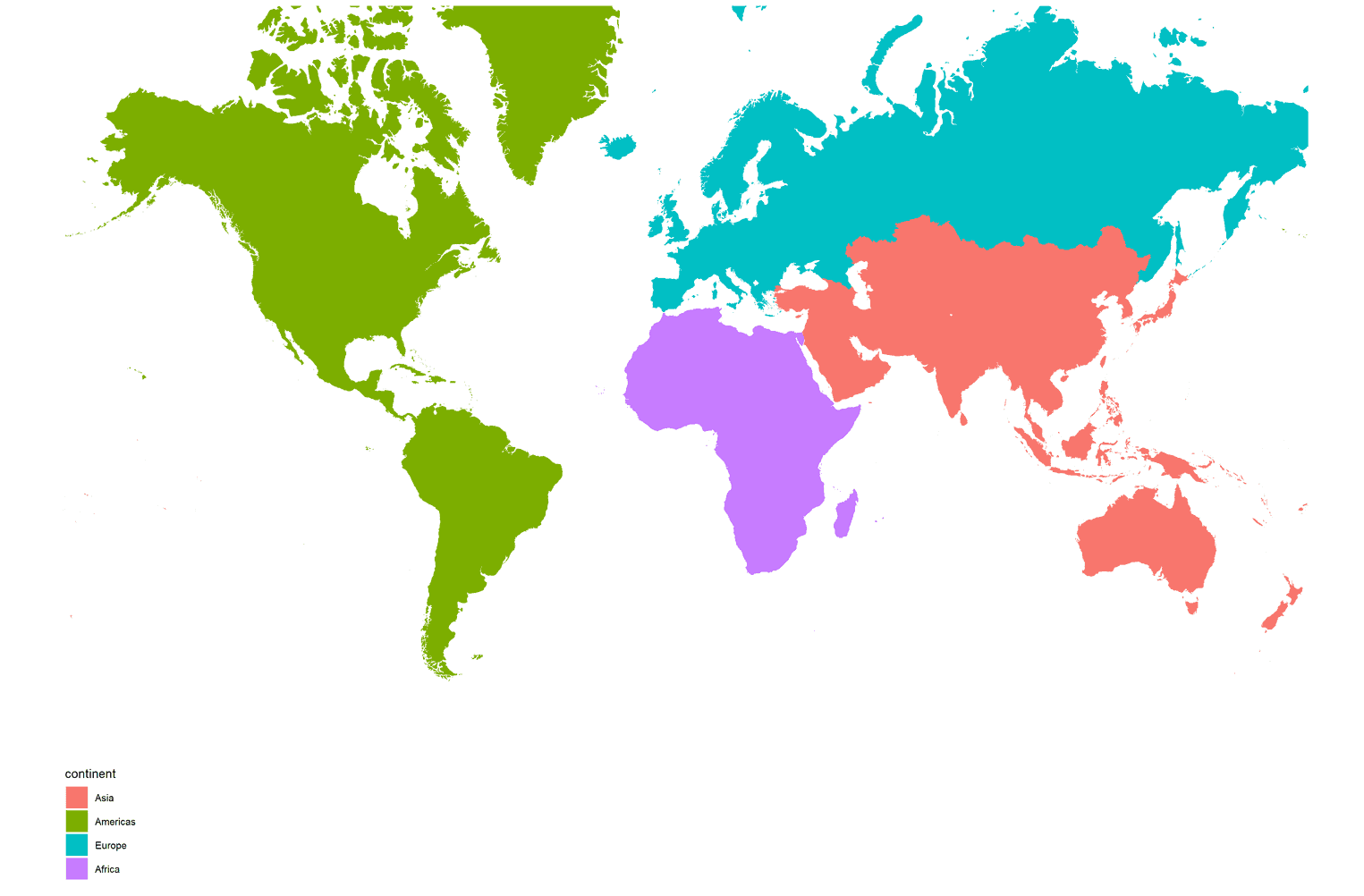
Life Expectancy Analysis - ‘gapminder’ dataset
The gapminder dataset has data on life expectancy, population, and GDP per capita for 142 countries from 1952 to 2007.
A glimpse of the variable names, variable types, etc. and a look at the first 20 rows of data:
glimpse(gapminder)## Rows: 1,704
## Columns: 6
## $ country <fct> "Afghanistan", "Afghanistan", "Afghanistan", "Afghanistan", …
## $ continent <fct> Asia, Asia, Asia, Asia, Asia, Asia, Asia, Asia, Asia, Asia, …
## $ year <int> 1952, 1957, 1962, 1967, 1972, 1977, 1982, 1987, 1992, 1997, …
## $ lifeExp <dbl> 28.801, 30.332, 31.997, 34.020, 36.088, 38.438, 39.854, 40.8…
## $ pop <int> 8425333, 9240934, 10267083, 11537966, 13079460, 14880372, 12…
## $ gdpPercap <dbl> 779.4453, 820.8530, 853.1007, 836.1971, 739.9811, 786.1134, …head(gapminder, 20) # look at the first 20 rows of the dataframe| country | continent | year | lifeExp | pop | gdpPercap |
|---|---|---|---|---|---|
| Afghanistan | Asia | 1952 | 28.8 | 8425333 | 779 |
| Afghanistan | Asia | 1957 | 30.3 | 9240934 | 821 |
| Afghanistan | Asia | 1962 | 32 | 10267083 | 853 |
| Afghanistan | Asia | 1967 | 34 | 11537966 | 836 |
| Afghanistan | Asia | 1972 | 36.1 | 13079460 | 740 |
| Afghanistan | Asia | 1977 | 38.4 | 14880372 | 786 |
| Afghanistan | Asia | 1982 | 39.9 | 12881816 | 978 |
| Afghanistan | Asia | 1987 | 40.8 | 13867957 | 852 |
| Afghanistan | Asia | 1992 | 41.7 | 16317921 | 649 |
| Afghanistan | Asia | 1997 | 41.8 | 22227415 | 635 |
| Afghanistan | Asia | 2002 | 42.1 | 25268405 | 727 |
| Afghanistan | Asia | 2007 | 43.8 | 31889923 | 975 |
| Albania | Europe | 1952 | 55.2 | 1282697 | 1.6e+03 |
| Albania | Europe | 1957 | 59.3 | 1476505 | 1.94e+03 |
| Albania | Europe | 1962 | 64.8 | 1728137 | 2.31e+03 |
| Albania | Europe | 1967 | 66.2 | 1984060 | 2.76e+03 |
| Albania | Europe | 1972 | 67.7 | 2263554 | 3.31e+03 |
| Albania | Europe | 1977 | 68.9 | 2509048 | 3.53e+03 |
| Albania | Europe | 1982 | 70.4 | 2780097 | 3.63e+03 |
| Albania | Europe | 1987 | 72 | 3075321 | 3.74e+03 |
Analysis of life expectancy over the years for India (Asia).

Creating the country_data and continent_data by filtering for India and Asia.
country_data <- gapminder %>%
            filter(country == "India") # choosing India, where I come from

continent_data <- gapminder %>%
            filter(continent == "Asia")
Life Expectancy vs year (India):
plot1 <- ggplot(data = country_data, mapping = aes(x = year, y = lifeExp))+
  geom_point() +
  geom_smooth(se = FALSE) +
  labs(title = "Life Expectancy over time - India",
      x = "Year",
      y = "Life Expectancy (yrs)")

plot1
## `geom_smooth()` using method = 'loess' and formula 'y ~ x'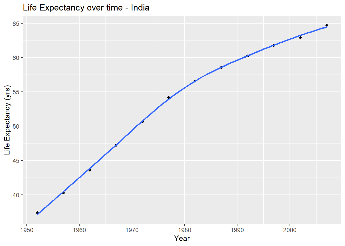
Plotting Life Expectancy over time for all countries in Asia:
ggplot(continent_data, mapping = aes(x = year , y = lifeExp  , colour= country, group = country))+
  geom_point() +
  geom_smooth(se = FALSE) +
  theme_bw() +
  labs(title = "National Life Expectancies over time - Asia",
       x = "Year",
       y = "Life Expectancy (yrs)") +
  NULL
## `geom_smooth()` using method = 'loess' and formula 'y ~ x'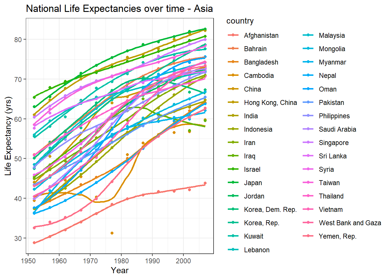
Plotting Life Expectancy over time for all continents.
ggplot(data = gapminder , mapping = aes(x = year , y = lifeExp , colour= continent))+
  geom_point() +
  geom_smooth(se = FALSE) +
  facet_wrap(~continent) +
  theme(legend.position="none") +
  labs(title = "Life Expectancy per Continent over time",
       x = "Year",
       y = "Life Expectancy (yrs)") +
  NULL
## `geom_smooth()` using method = 'loess' and formula 'y ~ x'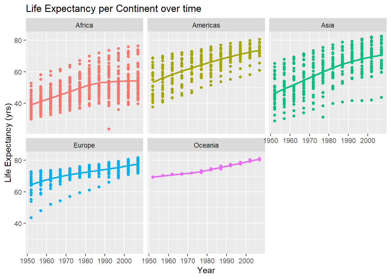
General Observations
While the overall life expectancy has increased over time, the extent and rate vary across continents. Higher income developed continents like Europe and Oceania had a comparatively much higher average life expectancy to start with in the 1950s and saw lesser overall growth in the last 70 years. Asia shows the largest jump in average life expectancy across countries, with a few noticeable outliers as in the case of Afghanistan which have seen very less growth possibly a result of their lower income and war. Africa has by far the lowest life expectancy and has seen minimal increase over the years, likely a result of their economic status, poor access to healthcare and infrastructure and social unrest. Interestingly, Africa’s average life expectancy today is lower than that of Europe and Oceania in the 1950s!
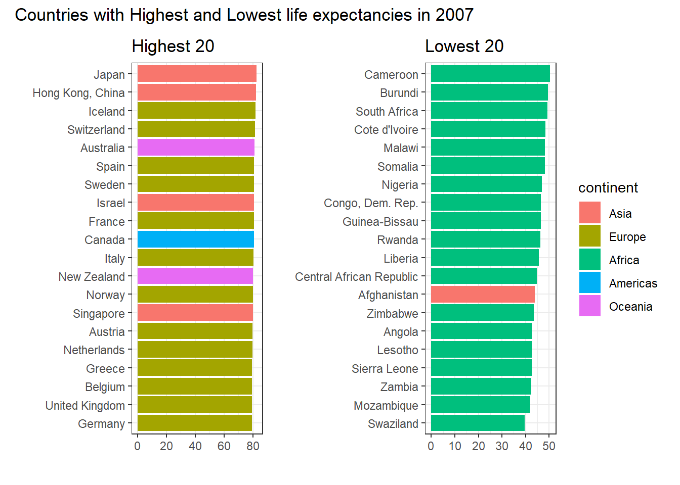
Looking at the countries with highest and lowest life expectencies
Predicting Life Expectancy
Analysing the effect of time, taken alone on LifeExp
model1 <- lm(lifeExp ~ year,
                      data= gapminder)
msummary(model1)
## Estimate Std. Error t value Pr(>|t|)
## (Intercept) -585.65219 32.31396 -18.12 <2e-16 ***
## year 0.32590 0.01632 19.96 <2e-16 ***
##
## Residual standard error: 11.63 on 1702 degrees of freedom
## Multiple R-squared: 0.1898, Adjusted R-squared: 0.1893
## F-statistic: 398.6 on 1 and 1702 DF, p-value: < 2.2e-16This does not capture individual trends in different continents, given that heir starting points in 1952 were different and so are the rates of increase.
Analysing the effect of multiple predictors on LifeExp
yearMin <- min(gapminder$year)

#Adjusting for year (starting from 1952 as baseline)
model2 <- lm(lifeExp ~ continent + I(year - yearMin) + pop,
                      data= gapminder)
msummary(model2)
## Estimate Std. Error t value Pr(>|t|)
## (Intercept) 3.990e+01 4.070e-01 98.037 <2e-16 ***
## continentAmericas 1.580e+01 5.148e-01 30.684 <2e-16 ***
## continentAsia 1.121e+01 4.843e-01 23.143 <2e-16 ***
## continentEurope 2.304e+01 4.845e-01 47.551 <2e-16 ***
## continentOceania 2.546e+01 1.522e+00 16.725 <2e-16 ***
## I(year - yearMin) 3.260e-01 1.031e-02 31.622 <2e-16 ***
## pop -1.407e-10 1.732e-09 -0.081 0.935
##
## Residual standard error: 7.318 on 1697 degrees of freedom
## Multiple R-squared: 0.6801, Adjusted R-squared: 0.679
## F-statistic: 601.4 on 6 and 1697 DF, p-value: < 2.2e-16Dropping population as it is an insignificant variable.
model3 <- lm(lifeExp ~ continent + I(year - yearMin),
                      data= gapminder)
msummary(model3)
## Estimate Std. Error t value Pr(>|t|)
## (Intercept) 39.90297 0.40684 98.08 <2e-16 ***
## continentAmericas 15.79341 0.51400 30.73 <2e-16 ***
## continentAsia 11.19957 0.47005 23.83 <2e-16 ***
## continentEurope 23.03836 0.48421 47.58 <2e-16 ***
## continentOceania 25.46088 1.52184 16.73 <2e-16 ***
## I(year - yearMin) 0.32590 0.01027 31.74 <2e-16 ***
##
## Residual standard error: 7.316 on 1698 degrees of freedom
## Multiple R-squared: 0.6801, Adjusted R-squared: 0.6792
## F-statistic: 722.1 on 5 and 1698 DF, p-value: < 2.2e-16All predictors in this model are significant and impact the life expectancy. Here for instance, the life expectancy of Africa in 1952 can be estimated as 39.9 years and the life expectancy in Asia in 2002 would be estimated as 56.2 years. The model explains about 67.9% of the change in Life Expectancy (Adjusted R squared).
Analysis of GDP Per Capita
GDP Percap vs year (India):
plot2 <- ggplot(data = country_data, mapping = aes(x = year, y = gdpPercap))+
  geom_point() +
  geom_smooth(se = FALSE) +
  labs(title = "GDP Percap over time - India",
      x = "Year",
      y = "GDP Percap")

plot2
## `geom_smooth()` using method = 'loess' and formula 'y ~ x'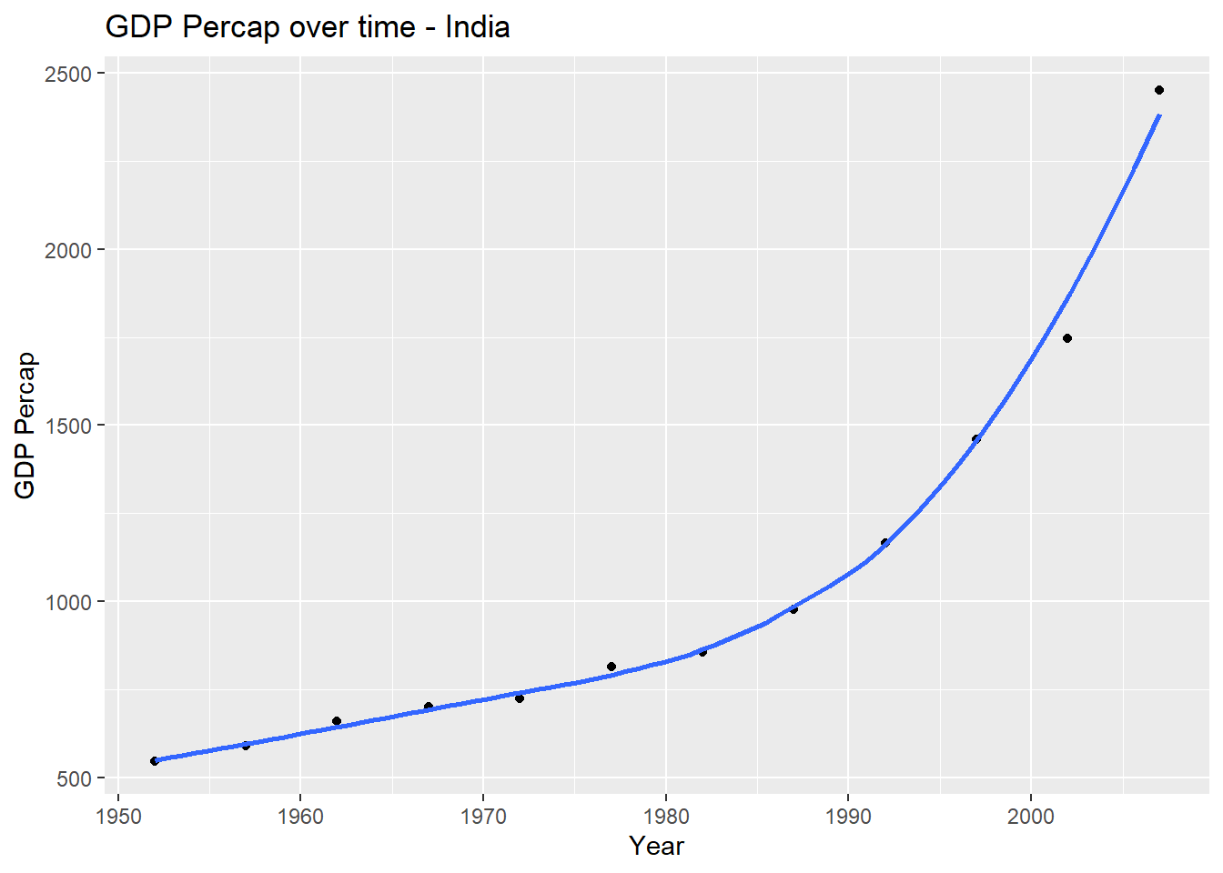
Plotting GDP Per Capita over time for all countries in Asia:
ggplot(continent_data, mapping = aes(x = year , y = gdpPercap  , colour= country, group = country))+
  geom_point() +
  geom_smooth(se = FALSE) +
  theme_bw() +
  labs(title = "GDP Per Cap over time - Asia",
       x = "Year",
       y = "GDP Percap") +
  NULL
## `geom_smooth()` using method = 'loess' and formula 'y ~ x'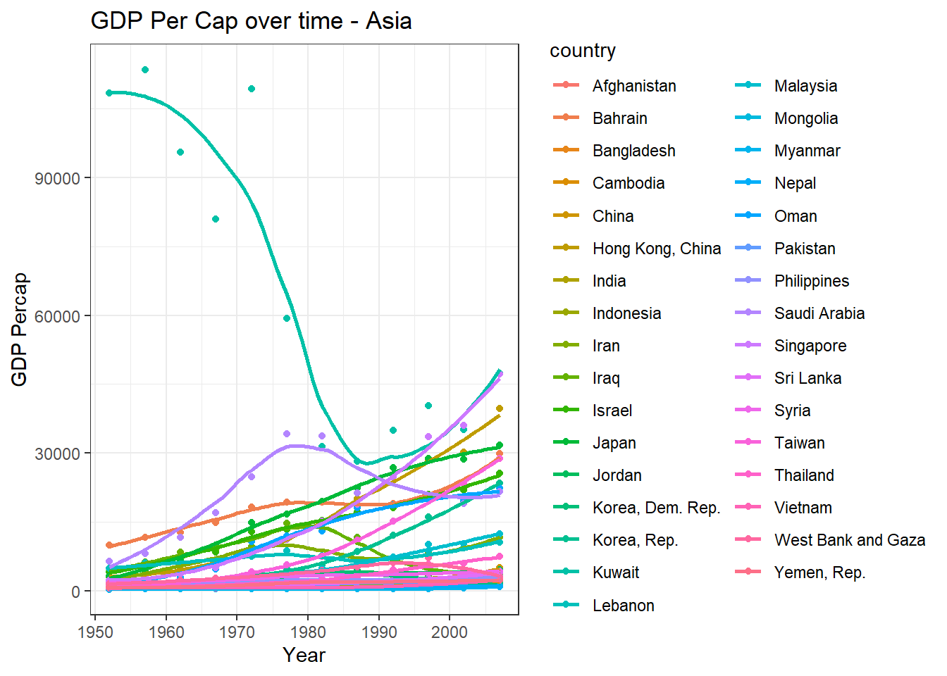
Plotting GDP Percap over time for all continents.
ggplot(data = gapminder , mapping = aes(x = year , y = gdpPercap , colour= continent))+
  geom_point() +
  geom_smooth(se = FALSE) +
  facet_wrap(~continent) +
  theme(legend.position="none") +
  labs(title = "GDP Percap per Continent over time",
       x = "Year",
       y = "GDP Percap") +
  NULL
## `geom_smooth()` using method = 'loess' and formula 'y ~ x'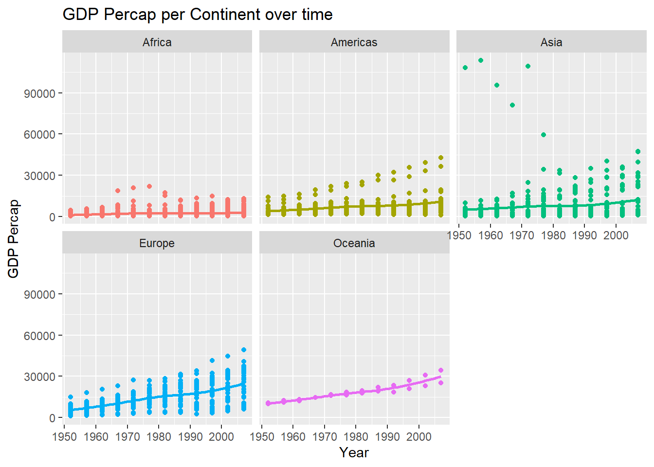
The average GDP percap for Africa has remained almost constant over the observed 5 decades, while a slight increase can be seen in Americas as well as Asia. The increase in the Americas is largely influenced by the USA and Canada’s rapid growth. Asia displays a few outliers in the initial 3 decades (Kuwait) and a few fast developing nations like Hong Kong, Saudi, Singapore, Japan etc whose GDP Percap has steadily increased till 2007. Europe and Oceania both show a more steady increase over the years with fewer outliers. The Americas, Europe and Asia also display a large gap between the counties with the highest and lowest GDP per cap, indicating a disproportionate development of certain countries over time than others.
library(gganimate)
library(patchwork)

default_palette = scales::hue_pal()(5)
names(default_palette) <- unique(gapminder$continent)

top_20_plot <- gapminder %>%
  filter(year == 2007) %>%
  select(year, continent, country, gdpPercap) %>%
  #arrange(year, desc(gdpPercap)) %>%
  slice_max(order_by = gdpPercap,n=20) %>%
  ggplot(aes(x=gdpPercap, y=fct_reorder(country, gdpPercap), fill=continent)) +
  geom_col() +
  theme_bw() +
  scale_fill_manual(values = default_palette) +
  theme(legend.position="none") +
  labs(title = "Highest 20",
       x="",
       y="")

bottom_20_plot <- gapminder %>%
  filter(year == 2007) %>%
  select(continent, country, gdpPercap) %>%
  slice_min(order_by = gdpPercap,n=20) %>%
  ggplot(aes(x=gdpPercap, y=fct_reorder(country, gdpPercap),
             fill=continent)) +
  geom_col() +
  theme_bw() +
  scale_fill_manual(values = default_palette) +
  labs(title = "Lowest 20",
       x="",
       y="")

combined_plot <- top_20_plot + bottom_20_plot +
  plot_annotation(title = "Countries with Highest and Lowest GDP Percap in 2007")

combined_plot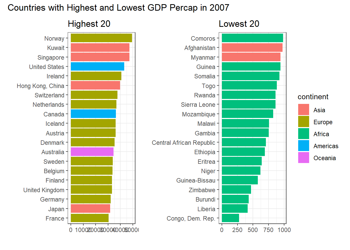
This plot better displays the disproportionate difference between the developed countries in Europe (and Asia/ the Americas) and the countries in Africa. 17 out of the top 20 countries are in Europe/ Asia while 90% of the bottom 20 are African countries whose socioeconomic situation has been affected by unrest and a lack of access to resources and capital. This was also evident from the earlier plot of life expectancy in the top and bottom 20 countries and their distribution.
Prediction of gdpPercap:
Analysing the effect of time, taken alone on GDP Percap
model4 <- lm(gdpPercap ~ I(year - yearMin),
                      data= gapminder)
msummary(model4)
## Estimate Std. Error t value Pr(>|t|)
## (Intercept) 3646.24 437.57 8.333 <2e-16 ***
## I(year - yearMin) 129.78 13.48 9.630 <2e-16 ***
##
## Residual standard error: 9602 on 1702 degrees of freedom
## Multiple R-squared: 0.05167, Adjusted R-squared: 0.05112
## F-statistic: 92.74 on 1 and 1702 DF, p-value: < 2.2e-16model5 <- lm(gdpPercap ~ continent + I(year - yearMin),
data= gapminder)
msummary(model5)## Estimate Std. Error t value Pr(>|t|)
## (Intercept) -1375.33 465.40 -2.955 0.00317 **
## continentAmericas 4942.36 588.00 8.405 < 2e-16 ***
## continentAsia 5708.40 537.72 10.616 < 2e-16 ***
## continentEurope 12275.72 553.92 22.162 < 2e-16 ***
## continentOceania 16427.85 1740.93 9.436 < 2e-16 ***
## I(year - yearMin) 129.78 11.75 11.049 < 2e-16 ***
##
## Residual standard error: 8369 on 1698 degrees of freedom
## Multiple R-squared: 0.2813, Adjusted R-squared: 0.2791
## F-statistic: 132.9 on 5 and 1698 DF, p-value: < 2.2e-16car::vif(model5)## GVIF Df GVIF^(1/(2*Df))
## continent 1 4 1
## I(year - yearMin) 1 1 1